I’m a big fan of Infographs – I think they’re a wonderful way to visually tell a story that might otherwise bore you with reams of text… This is one of the better ones I’ve seen in a while…
Infographs are fast becoming an efficient way to share stats and data in an interesting way. Alex Trimpe takes it to a different level with this video infograph. Very well done. Some pretty staggering stats in the screen cap below the video. Courtesy FastCo Design.
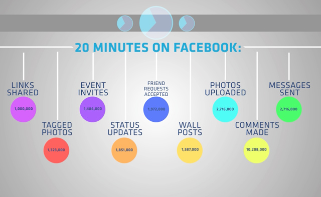
I missed this great infograph a couple of months ago put out by Mashable’s Muhammad Saleem. As you can see from previous posts over the last couple of weeks, I am a fan of visual representation of data. This one does a great job of laying out what the Facebook landscape usage looks like (at least what it looked like a few months ago). I wonder if the privacy issues over the last several weeks have changed people’s behavior pattern on Zuckerberg’s social platform? I’d bet yes – but you tell me – leave a comment if you’ve changed your usage due to privacy issues. My usage is painfully average in some ways, but well beyond average in other ways. Personally – I find myself using Facebook to keep in touch with my friends, gather info, and sending good wishes to people on my friends list around celebratory life events. I don’t typically join groups – a very selective few, and ‘fan’ very few pages. What I do is mostly comment, ‘like’ and share interesting articles that I’ve come across.
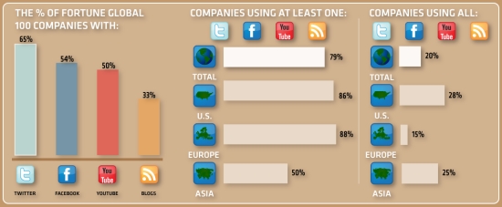
I happen to work for a Fortune 100 company (Intel) and I would say that the following infograph is a fairly accurate representation of most companies with regards to their Social Media participation. I think Intel is a bit different and we’ve been recognized as an early (and often) adopter of Social Media within our marketing and media campaign efforts. The graphic below is a small snippet of the full infograph – click for expanded version.
The digital world is abundant with infographs. One of the best in the business is Flowtown, which has an uncanny ability to break down marketing and media stats in a very interesting and visual way. I get a lot of these passed through my social graph, and today a new one hit my radar. What’s different about it is that ‘we’ are the participants and are involved in creating an infograph that is uniquely ‘ours’. This crossed my Twitter feed, Facebook news stream, and email at convergent times throughout the day today. I decided to take a minute and input my data. If you’d like to do the same, you can do so @ the Ionz home page (quick tip, if you don’t speak Portuguese, you can translate to English in the upper right hand corner). Image clickable for larger resolution.